T2 — Global Campaign Execution & Digital Rollout
Ensuring high-quality, consistent digital experiences for a global retail brand.
Role: Digital Designer
Focus: Campaign execution, brand expression, cross-channel delivery
Channels: Web, eDM, in-store digital, social
The Context
As a Digital Designer at T2, I focused on the end-to-end execution of multi-channel digital campaigns. My role involved translating diverse creative directions—from clean, editorial narratives to vibrant, high-energy seasonal themes—into high-performing digital environments.
How I Helped the Brand
The Bridge: I acted as the link between the initial creative "look" and the technical final product. I made sure the design didn't just look good, but was ready to be sent out to millions of customers.
Quality Control: I made sure every single digital piece followed T2's brand rules. I focused on the small details—like spacing, clear text, and fast loading—to ensure a premium feel.
Accessible Design: I ensured all our digital work was easy to read and use for everyone, including people with vision impairments, by following official accessibility standards.
Selected Campaigns
A selection of seasonal and campaign work delivered across web, email, in-store digital, and social channels.
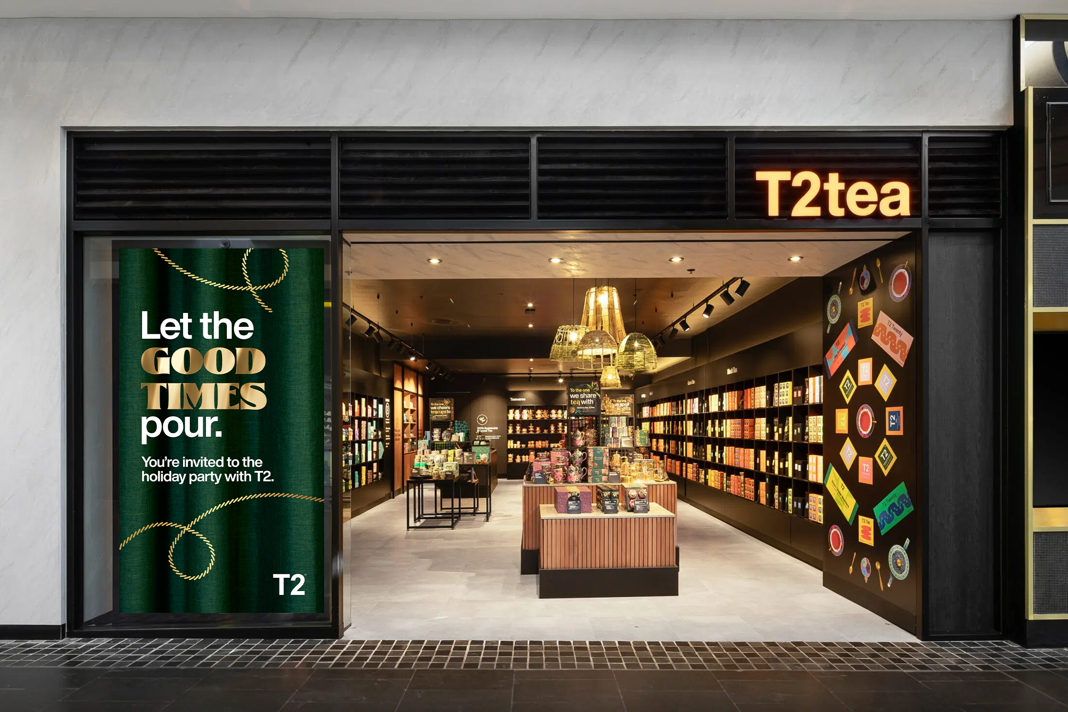
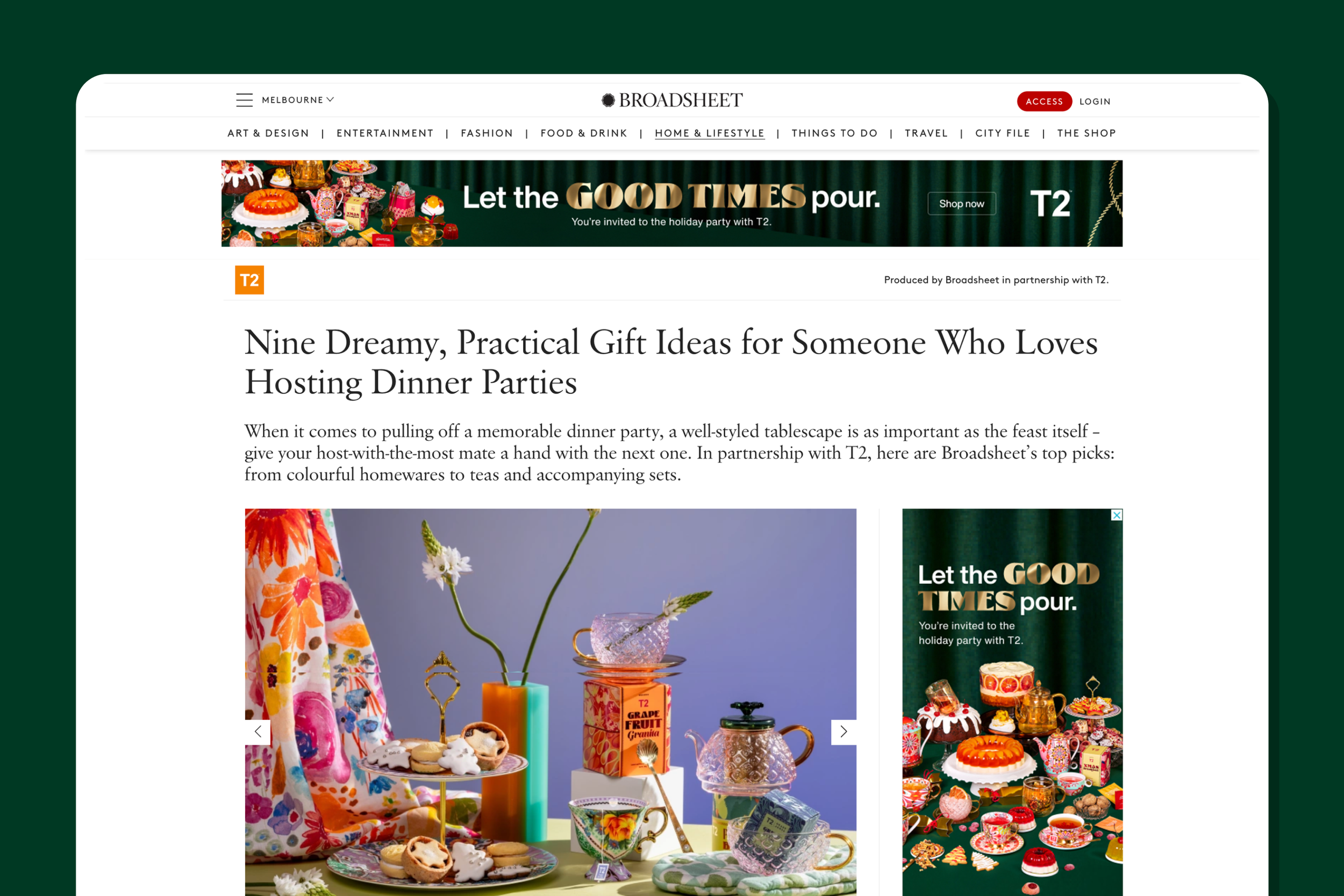
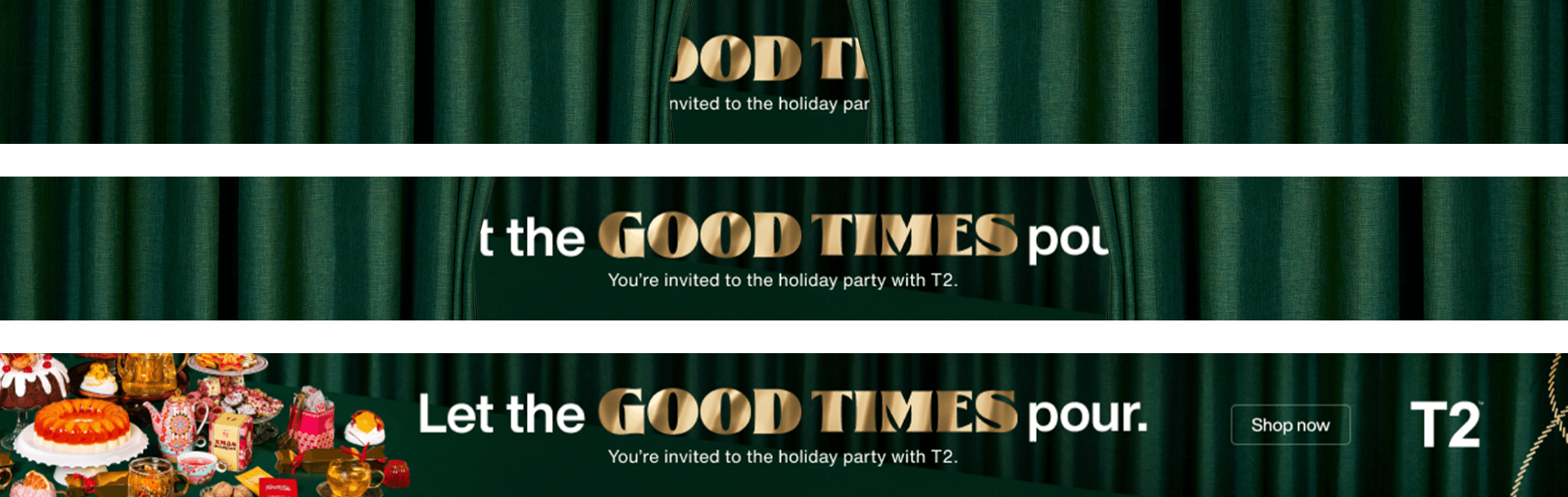
Festive Campaign
Web · eDM · In-store Digital
The Goal: Drive holiday sales through a lush, maximalist visual identity.
The Execution: I took the core "Good Times" artwork into high-impact digital assets—including HTML5 banners, animated in-store screens, and modular eDMs—by optimizing complex brand visuals for performance and accessibility across all global touchpoints.
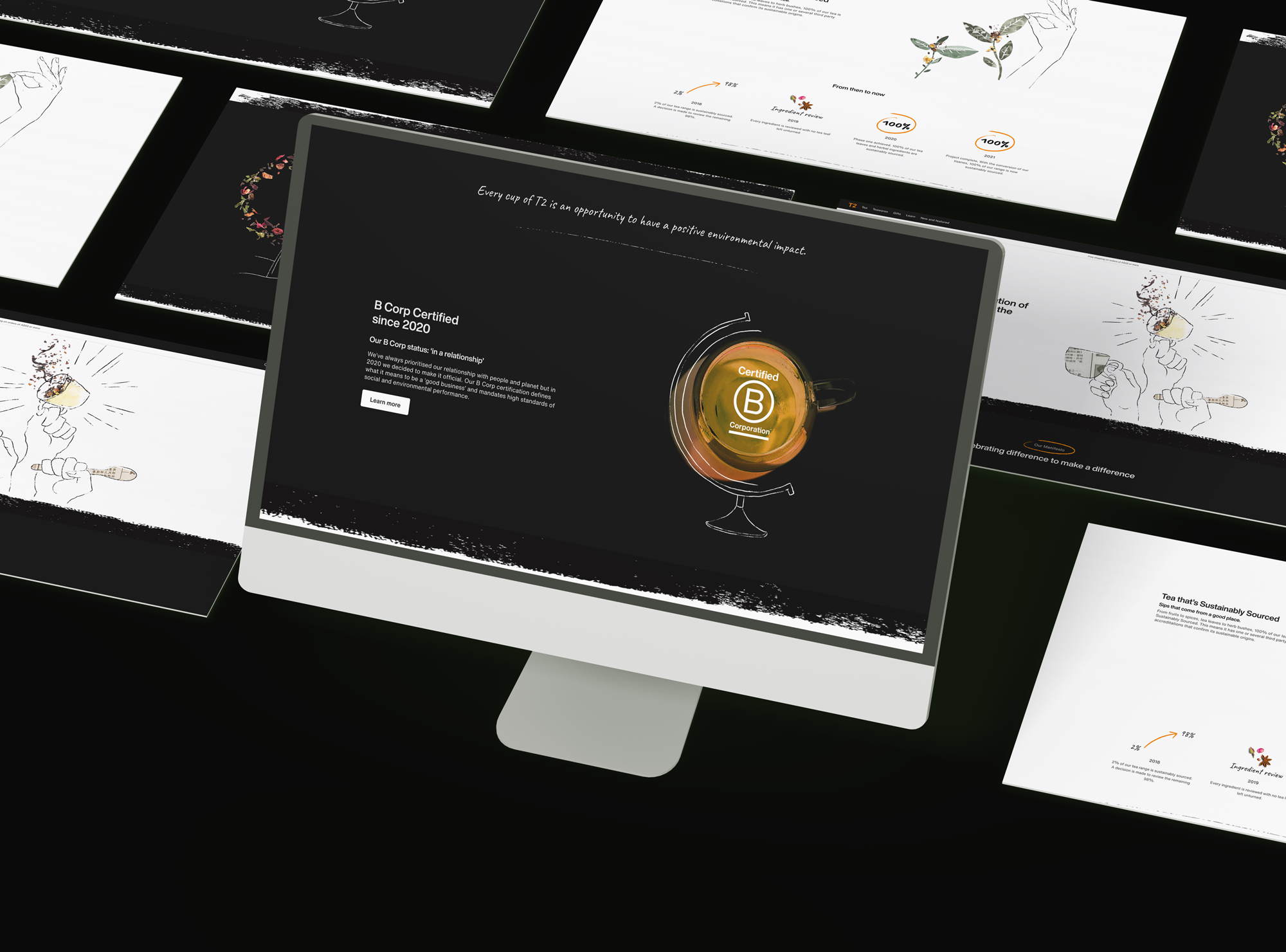
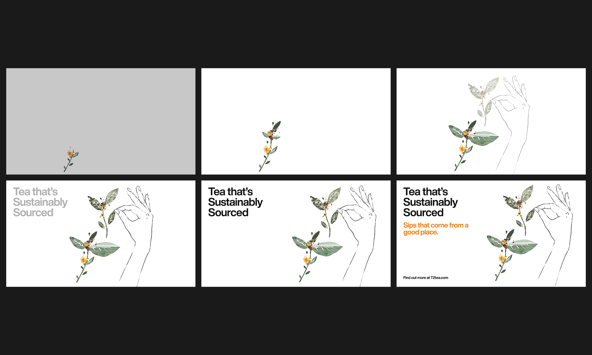
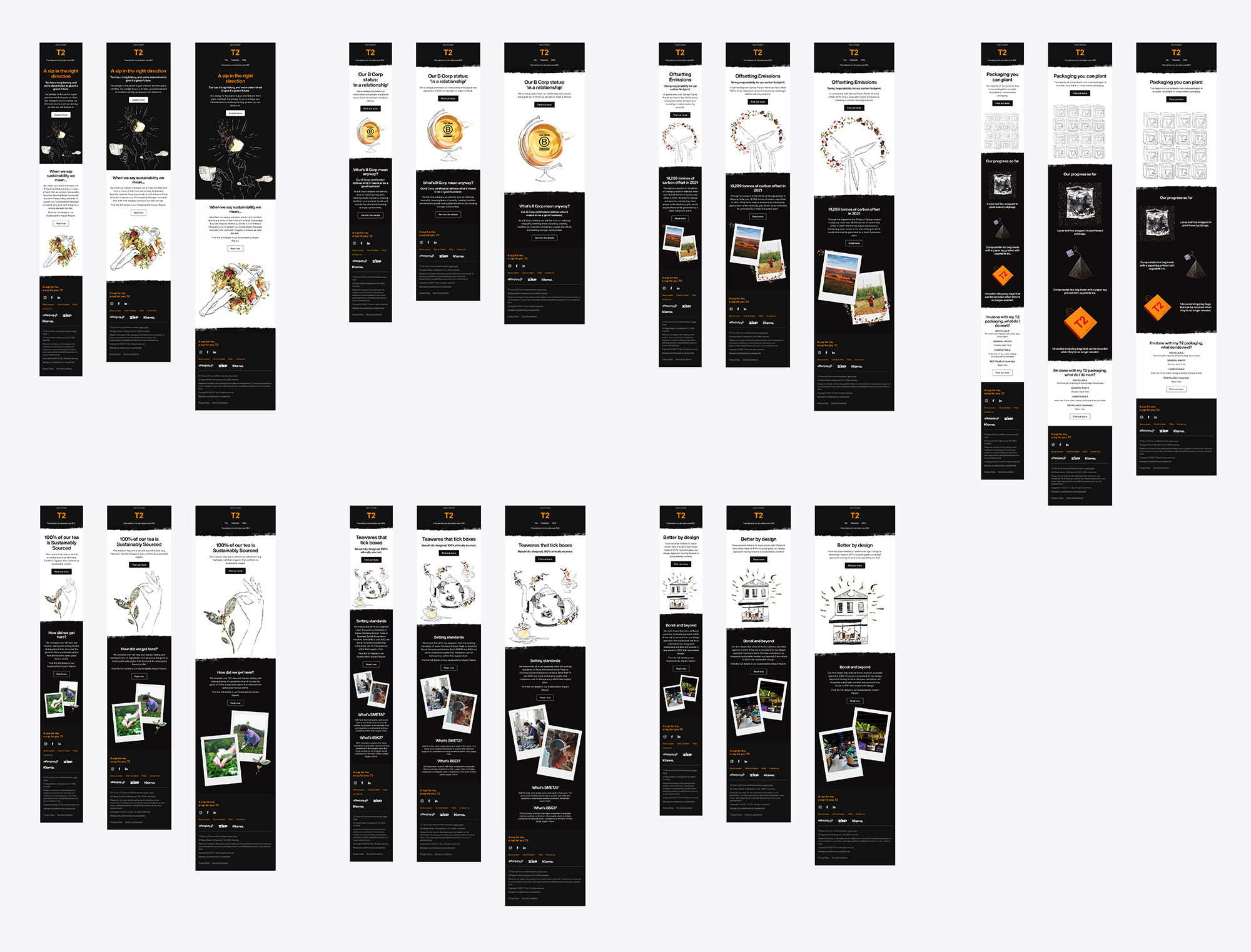
Sustainability Campaign
Landing Page · Email · Motion
The Goal: Communicate T2’s B-Corp status and ethical sourcing with a cleaner, more editorial feel.
The Execution: Focused on a "Digital First" rollout, I optimized the layout for speed and clarity, ensuring the heavy information load remained digestible for the user.
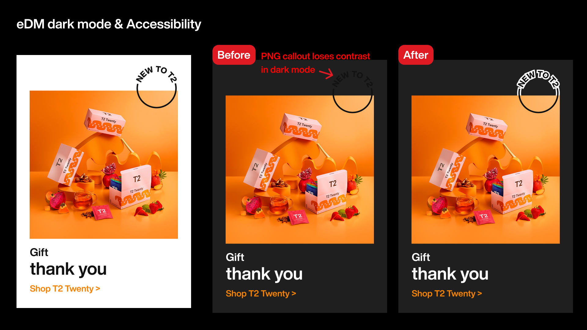
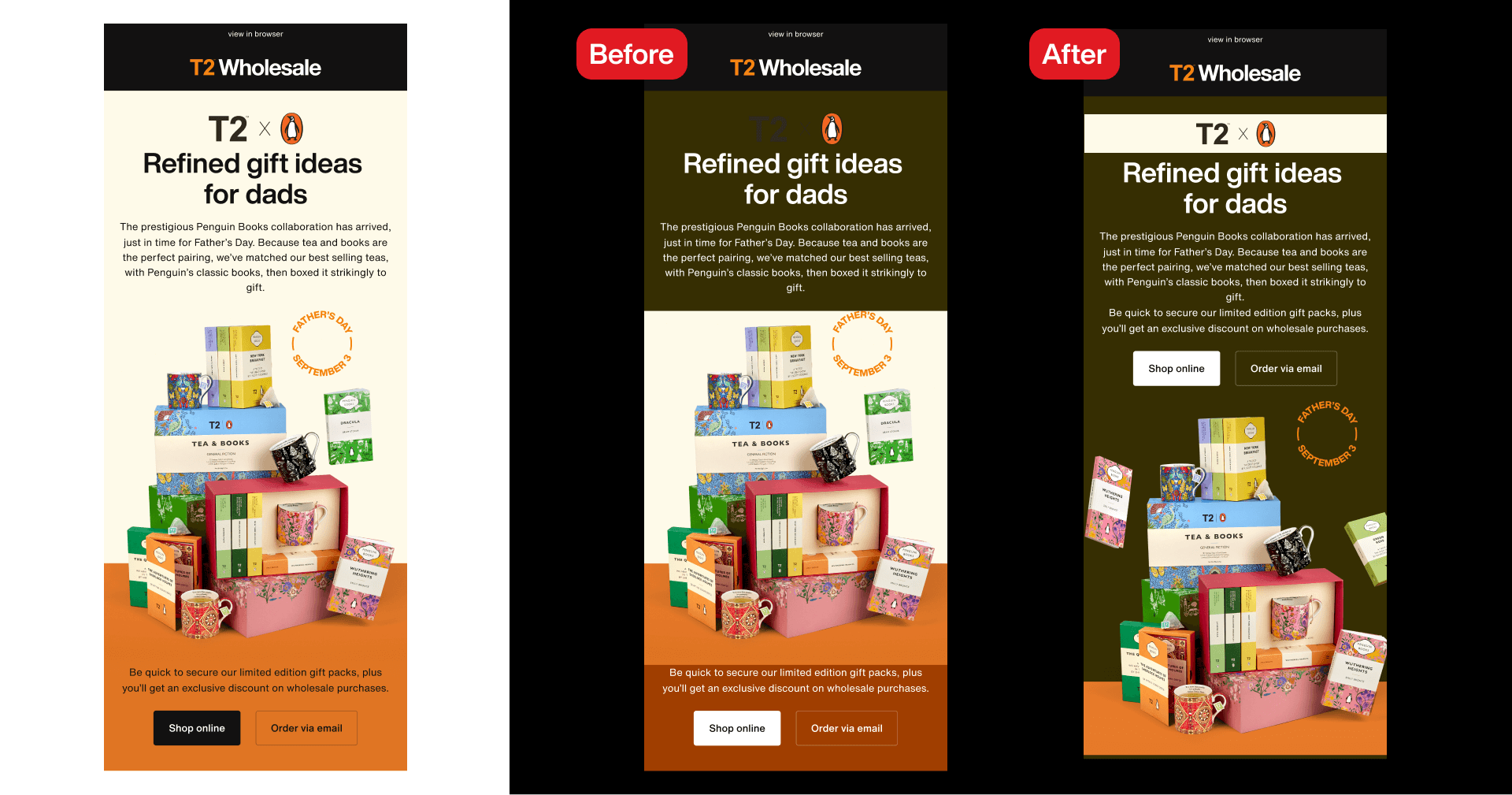
Technical Spotlight: Accessibility
Inclusive Design Considerations
Design isn't just about how it looks; it's about who can use it. Accessibility was an important consideration, particularly when working with T2’s established brand colours and email design constraints. Wherever possible, layouts prioritised live text to support flexibility across email clients and dark mode environments. In cases where text needed to be embedded within imagery, I ensured sufficient contrast and applied outlines or visual separation so key messaging remained legible when background colours shifted in dark mode.
Outcomes & Toolkit
The Impact
Efficiency: Streamlined the asset creation process, allowing for faster turnaround on global campaign launches.
Consistency: Zero brand drift across 50+ unique digital and print assets per campaign.
Engagement: Delivered high-performance EDMs with optimized click-through layouts.
Toolkit: Figma, Adobe Creative Suite (Photoshop, Illustrator, InDesign)