QV Skincare — An Elastic Campaign Universe
Evolving a trusted household staple into an adaptable visual world for seasonal retail storytelling.
Role: Designer (Art Direction→ Execution)
Scope: Creative Strategy, Key Visuals, Scalable Campaign Architecture
Tools: Figma, Illustrator, Photoshop, After Effects, GenAI
The Challenge
Beyond the Bathroom Shelf: Reimagining Everyday Care
In most Australian homes, QV lives quietly on bathroom shelves. People trust it because it is simple, gentle, and unpretentious. The blue-and-white bottles aren't trying to be trendy—they just work.
The problem comes when retail campaigns hit. Busy pharmacy aisles are filled with screaming discount badges and crowded promotional banners. If a brand stays too quiet, it gets lost on the shelf; if it starts screaming with flashy graphics or generic stock photos, it loses the calm trust people rely on.
The design challenge was to find that balance: How do you make QV feel exciting and seasonal in high-traffic retail aisles without losing the honest, everyday character people already know?
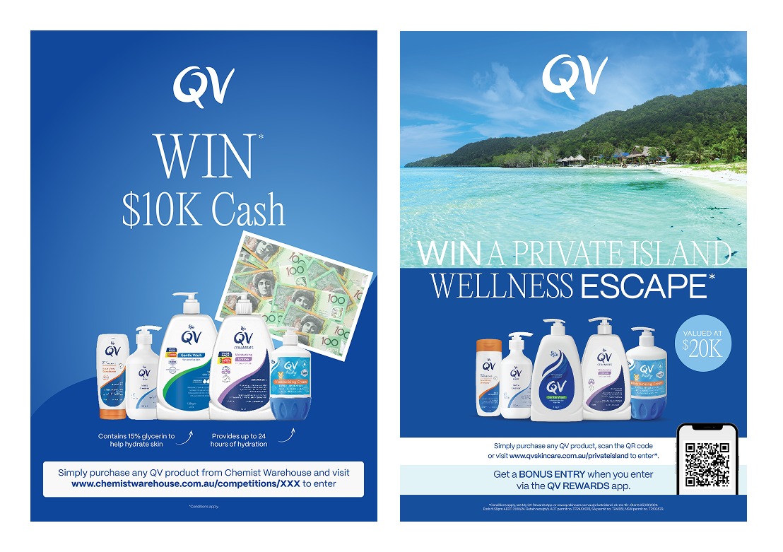
Previous campaign visuals: generic stock imagery and fragmented layouts that diluted brand recognition.
The Concept
A Calm Product in an Expressive World
Instead of using busy stock photos or generic promotional stickers, the idea was to split every artwork into two distinct jobs: the foreground protects the brand, and the background tells the story.
Brand gradients for atmosphere; simple vector icons to set the theme; hero products kept clean in the foreground.
The design system relies on three straightforward elements:
Clean Hero Products: The bottles stay completely untouched and front-and-center. Customers instantly recognize the packaging and the everyday reliability it represents.
Sub-Brand Color Horizons: Rather than fighting against brand guidelines, the background builds directly upon them. Using the distinct purple established for the QV Ceramides range, smooth gradients create warmth, depth, and seasonal atmosphere while keeping sub-brand recognition unmistakable.
Minimal Vector Details: Simple graphic shapes—like palm tree silhouettes, flight trails, or gift bursts—quickly explain what the promotion is about (a summer trip, a holiday giveaway) without cluttering the scene.
By letting the packaging and its distinct range colors anchor the piece, the surrounding shapes and gradients can adapt to any promotional theme while staying true to the brand
The Execution
An Elastic System Across Diverse Briefs
The strength of this art direction lies in its elasticity. By keeping the QV Ceramides gradient horizon and clean packaging architecture constant, the background adapts to completely different lifestyle moments—shifting seamlessly from nostalgic summer days to restful weekend staycations and high-energy music festivals.
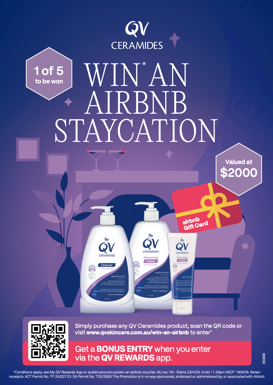
Campaign 2: Airbnb Staycation
The Brief: Encourage larger basket sizes and app engagement by offering a high-value $2,000 getaway voucher.
The Concept: Minimalist staycation silhouettes—cocktail glasses, a lounge chair, and house plants—creating a calm, evening mood centered on rest and self-care.
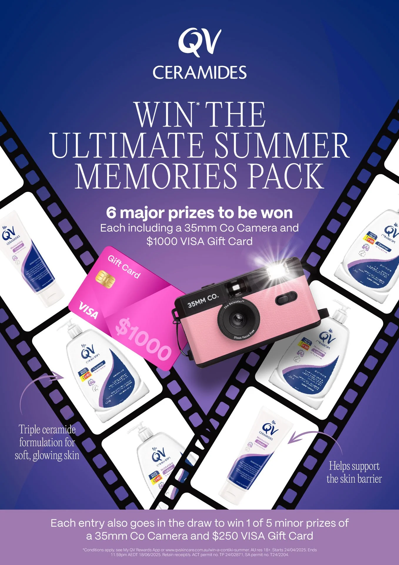
Campaign 1: Summer Memories
The Brief: Drive sales of the QV Ceramides range via an engaging summer competition featuring retro film cameras and cash prizes.
The Concept: A diagonal 35mm film strip framing product polaroids, grounding the promotion in summer nostalgia.
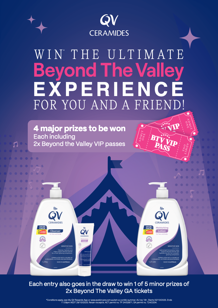
Campaign 3: Beyond The Valley Festival
The Brief: Connect the therapeutic skincare range to a younger demographic through major music festival VIP ticket giveaways.
The Concept: Symmetrical marquee staging, spotlight beams, and floating VIP passes that translate the signature purple palette into energetic nightlife culture.
In-Store Experience
Translating the Story to the Pharmacy Floor
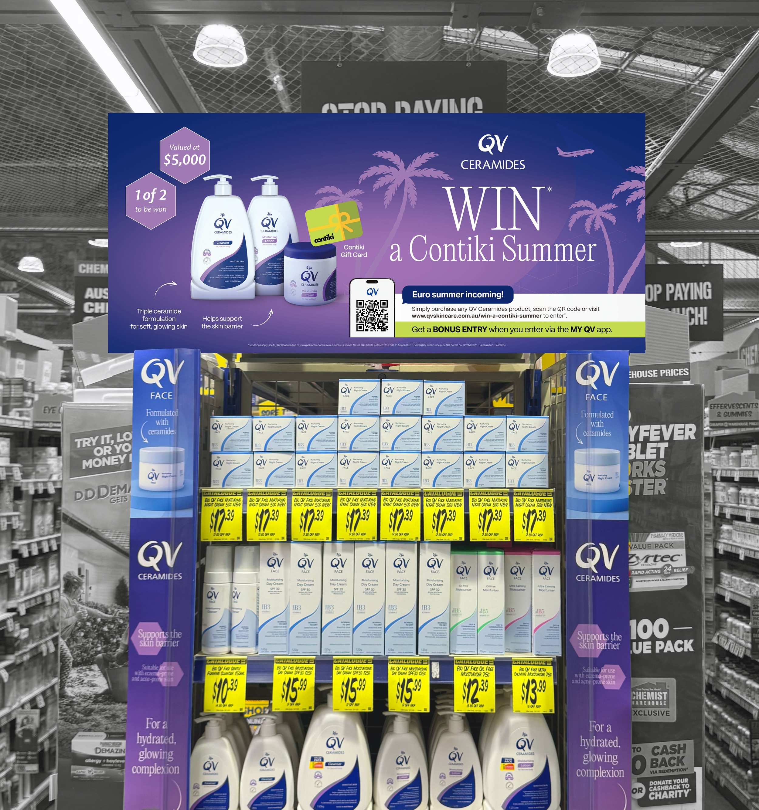
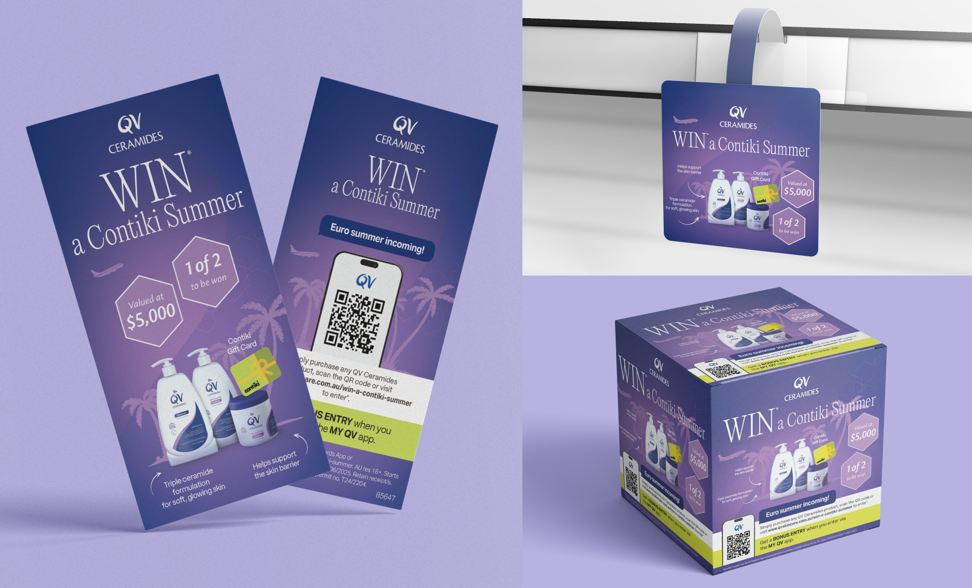
An idea only works if it holds up across the entire physical store environment. The visual architecture was scaled across high-impact physical displays—from aisle-end pallet wraps and hanging POS to animated digital screens—ensuring the campaign captures attention whether printed or in motion.
The Outcome
By establishing an illustrative, atmospheric world instead of relying on disconnected stock imagery, QV gained an enduring campaign identity. The brand can step into diverse promotional moments—travel, gifting, or seasonal routines—while keeping its down-to-earth honesty front and center.
Future Roadmap & Innovation
Beyond Vectors: Exploring Generative Lifestyle Worlds
While the vector framework solved the need for rapid, brand-safe retail scaling, we began exploring the next phase of visual storytelling for QV Ceramides. Full-scale lifestyle photoshoots across changing climates and locations remain cost-prohibitive for short-turnaround retail cycles.
To test a more cinematic and tactile approach, I developed an experimental workflow using Generative AI. By directing prompts around authentic Australian natural light, beach textures, and clean architectural spaces, this pipeline produces custom photographic scenes designed specifically around the product’s therapeutic qualities.
Rather than staying purely digital, these photographic explorations were tested directly against retail display fixtures. This confirmed that a warm, camera-led aesthetic can cut through dense pharmacy aisles just as effectively as bold graphic vectors—offering a viable future roadmap for the brand’s visual identity.
Phase 1: Generative Exploration & Prompt

Generative AI workflow exploring natural light, sand textures, and lifestyle environments tailored to the QV products
Phase 2: In-Store Lifestyle Prototyping
Concept test render: validating the aisle visibility and physical shelf impact of photographic assets within a high-density pharmacy fixture.