QUT Online — Scaling UI Through Design Systems
Role: UI Designer
Collaboration: Harry Zhou, Molly Seeary
Focus: UI systems, interaction design, customer experience
Overview
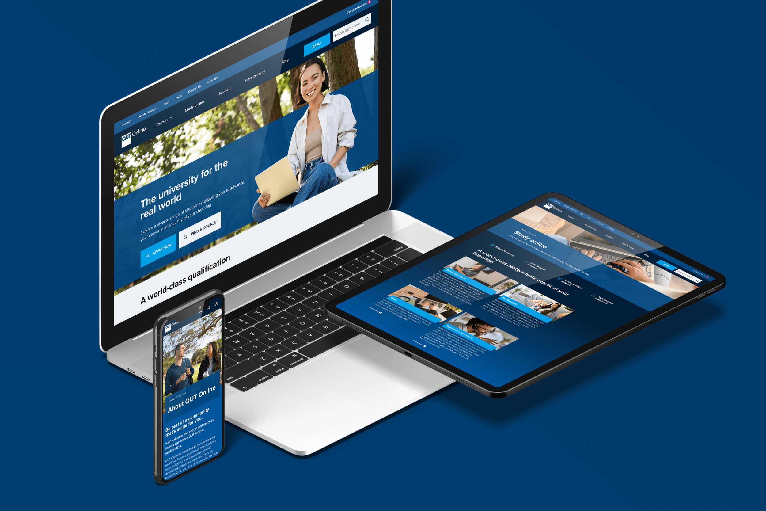
QUT Online is a large-scale education platform supporting prospective and current students across course discovery, enrolment, and ongoing study.
I led the UI redesign with a focus on systemisation, consistency, and usability, addressing fragmented patterns and improving how students navigate complex information across devices.
Context
The legacy QUT Online experience suffered from:
Inconsistent UI patterns across pages
Fragmented navigation and hierarchy
Limited interactive support for complex student decisions
No centralised design system to guide future work
Objective
Redesign the platform to be:
More intuitive and student-focused
Visually consistent across all touchpoints
Scalable through a shared design system
Fully responsive and accessible
My Role & Contributions
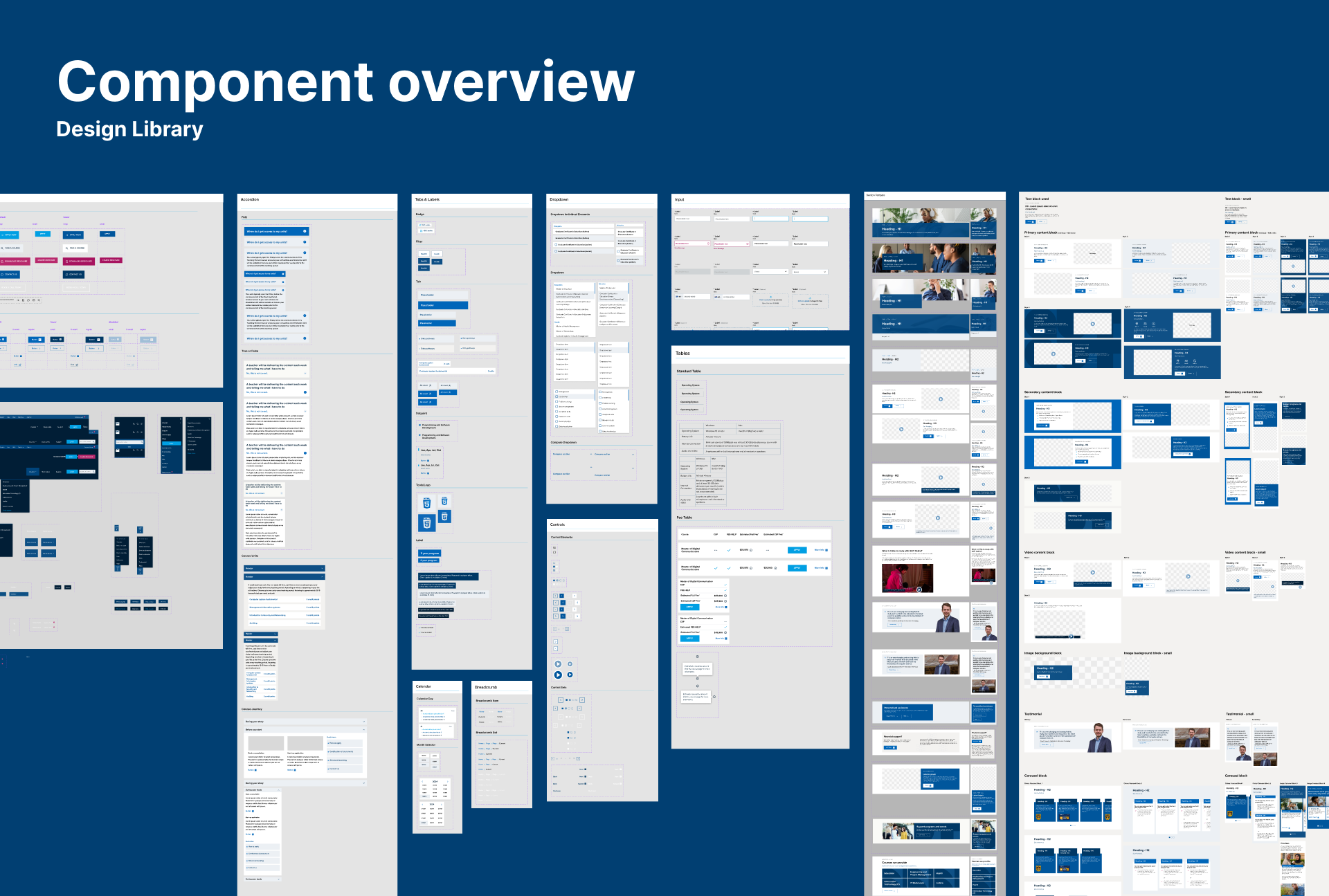
Design System Foundation
I designed and implemented a scalable design system in Figma, defining core components, layout rules, and interaction patterns.
This system established a single source of truth for UI decisions and enabled faster, more consistent delivery across the platform.
I worked closely with designers and stakeholders to iterate quickly and align design decisions with both user needs and delivery constraints.
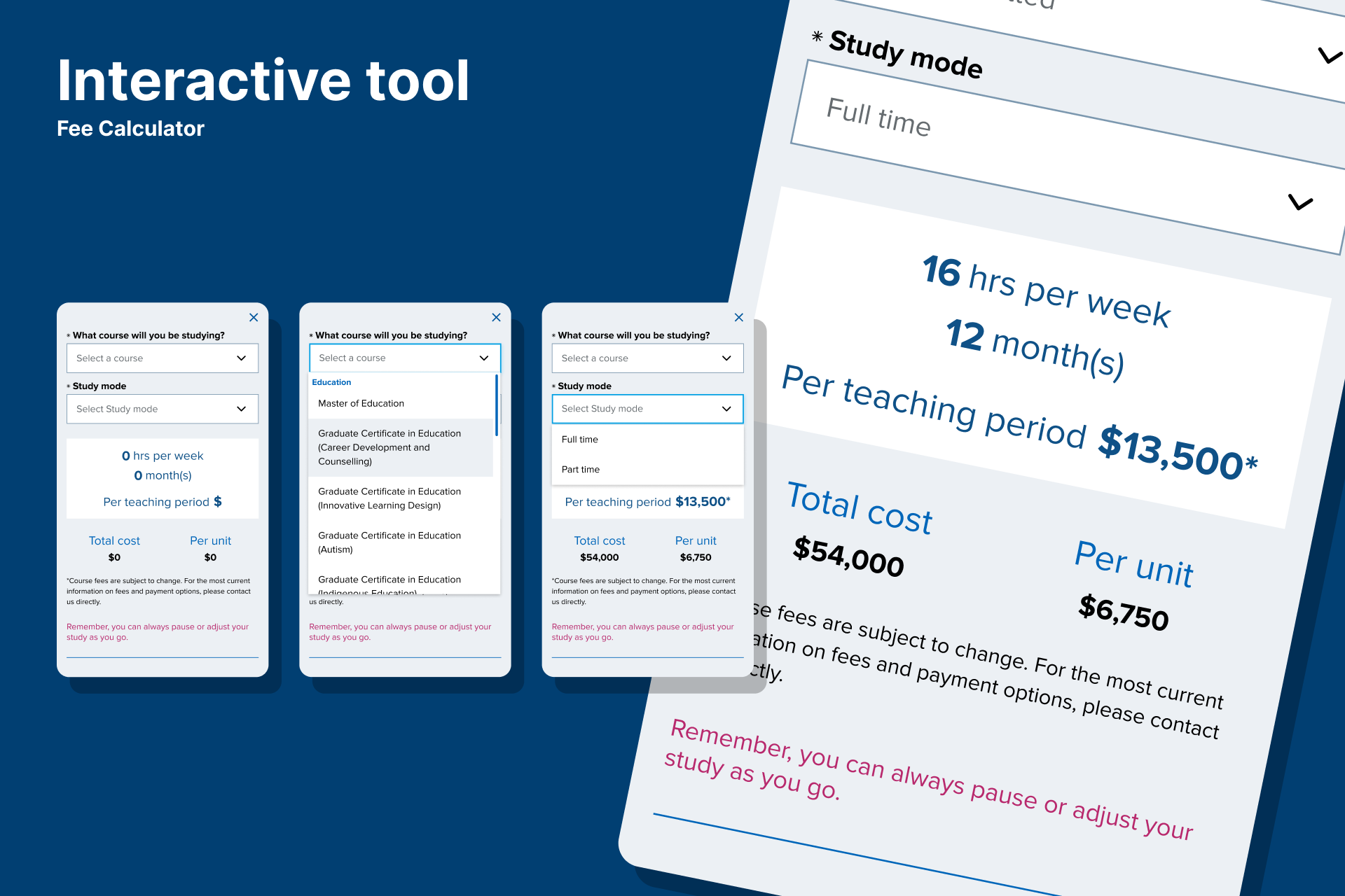
Interactive Tools & Modular Features
To address key student pain points, I designed modular tools that allowed users to engage directly with complex information, including:
Eligibility Checker
Completion Forecast
Fee Calculator
These tools transformed static content into interactive decision-support experiences, improving clarity and engagement.
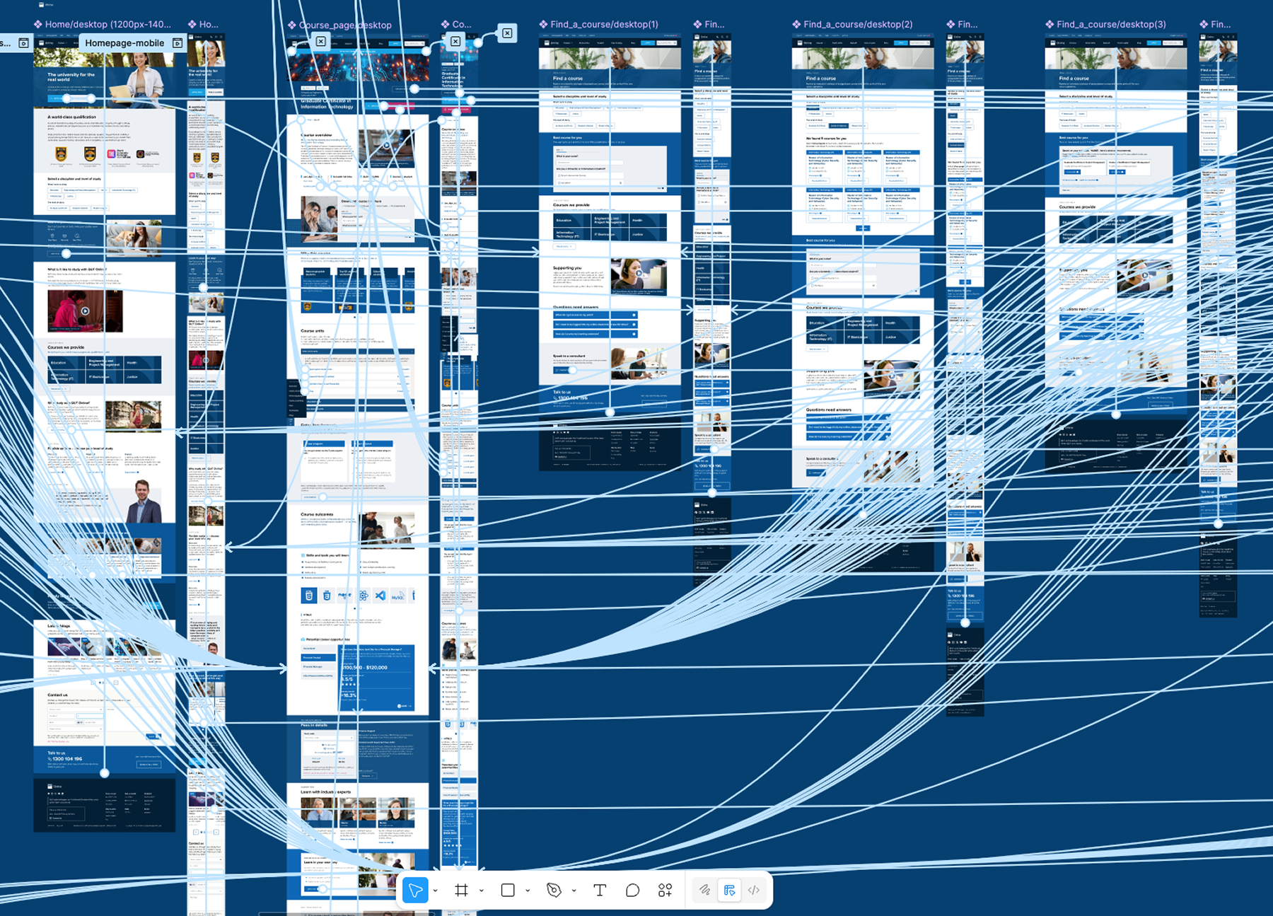
Prototyping & Validation
I built a high-fidelity, interactive Figma prototype to demonstrate:
Navigation flows
Component behaviour
Interactive logic
This allowed stakeholders to experience the redesign first-hand and gave the team confidence before development.
User Testing & Iteration
I conducted usability testing sessions with the prototype to:
Validate assumptions
Identify usability issues
Refine interaction patterns
Insights from testing directly informed design refinements before hand-off, reducing implementation risk.
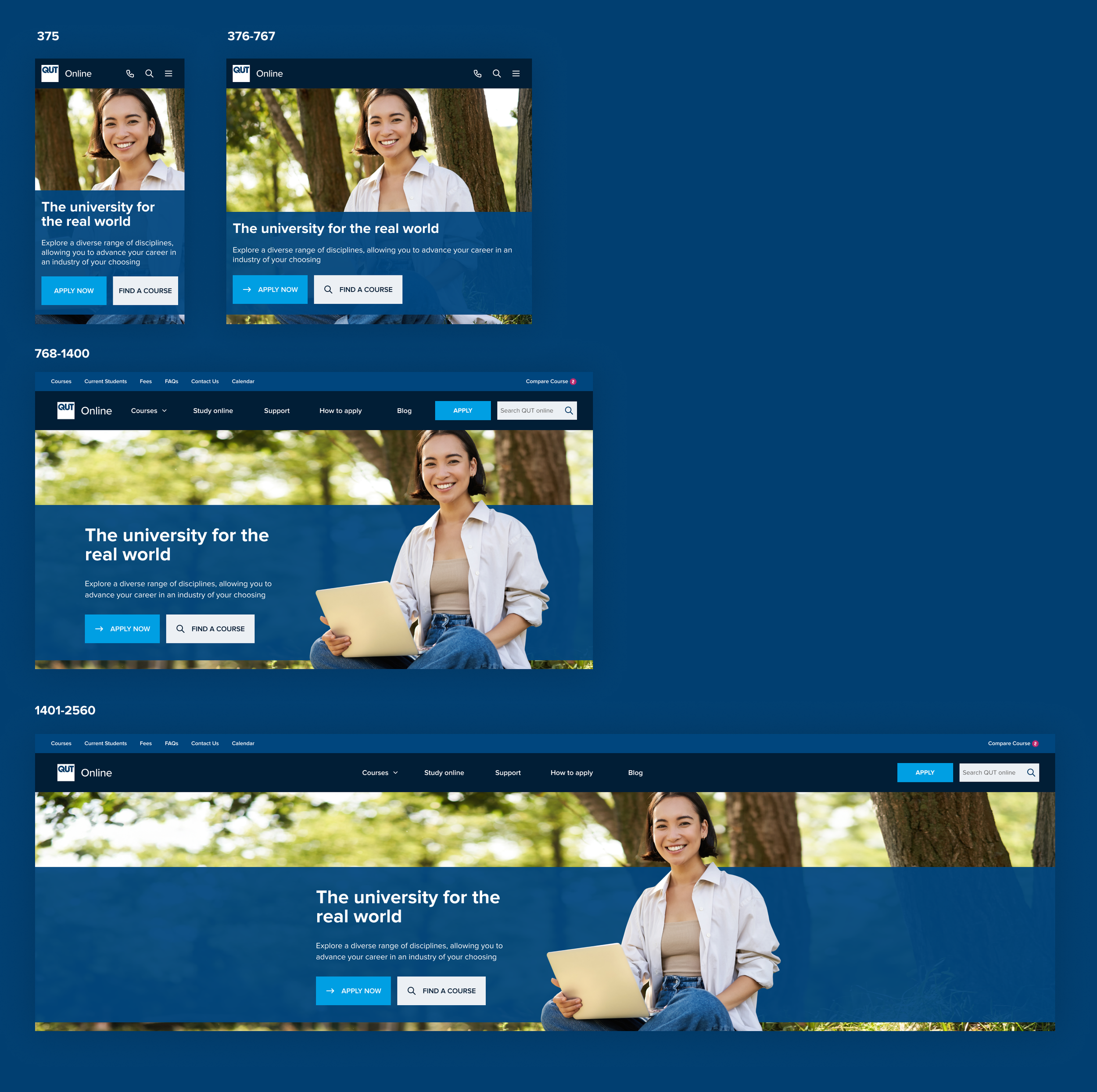
Responsive & Accessible Design
All designs were optimised for:
Desktop, tablet, and mobile
Clear hierarchy and readable spacing
Accessibility best practices, including contrast and interaction clarity
This ensured a consistent experience regardless of device or ability.
Process Summary
This project was less about visual novelty and more about clarity, structure, and decision-making.
Define & Align
Clarified user and business goals
Mapped critical student journeys
Design System Build
Established scalable components and usage rules
Interactive Prototyping
Created clickable, high-fidelity flows
Test & Refine
Validated designs with users before development
Each stage reduced ambiguity and improved delivery confidence.
Outcome
The redesign delivered a modern, system-led interface that:
Improved usability for prospective and current students
Increased discoverability of key tools and resources
Standardised visual language for future scalability
Reduced design inconsistency across the platform
Early user testing showed higher task success rates for course exploration and tool usage, indicating clearer support for student goals.
Reflection
This project reinforced the importance of establishing systems early.
Launching pages without a guiding design system led to avoidable rework. By tightening components mid-project, we achieved stronger coherence — but the biggest lesson was preventative:
Invest in systems before screens
Align conventions early
Document interaction behaviour clearly
These principles now underpin how I approach large-scale digital platforms.